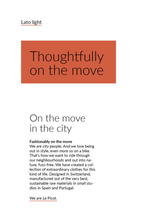
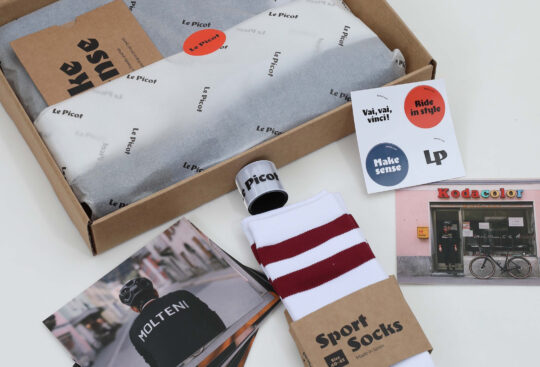
An identity that works globally and in all kinds of use, from digital space, to print, and to specific textile applications.
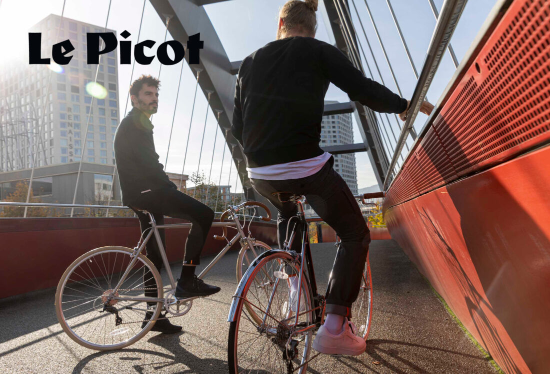
A new brand for a new slow fashion label for urban people on the move, modern, inspiring, cosmopolitan yet locally rooted, that was the briefing given to us by the team of Le Picot. Their brand needed to be comprehensive, combining an existing portfolio of vintage replicas of historic racing jerseys with a new collection of innovative design classics for mobile urbanites. The technical requirements were also quite diverse: the brand elements had to work in textile applications such as embroidery or fabric prints, as well as on screens of all sizes, and enable a global appeal.
We developed a market presence that allows Le Picot to bridge the gap between yesterday and tomorrow and presents the brand as sophisticated and contemporary, yet unpretentious, straightforward, honest, and authentic. As a result, Le Picot stands out from the crowd, appearing both innovative and traditional at the same time.
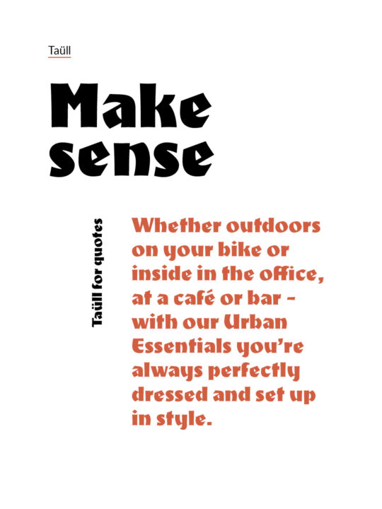
As the heart of the identity, we defined a typeface full of character, reminiscent of wooden letters. Its style leads into the world of the Breton Fernand Picot, to whom the brand has an anecdotal reference. We contrasted the archaic nature of the text mark with a very contemporary typeface that is optimally designed for digital applications. We continued the originality of the figurative mark in the brand color scheme. But it is not an end in itself. Rather, it differentiates Le Picot from the pace of fast fashion and refers to the brand’s high sustainability goals.